
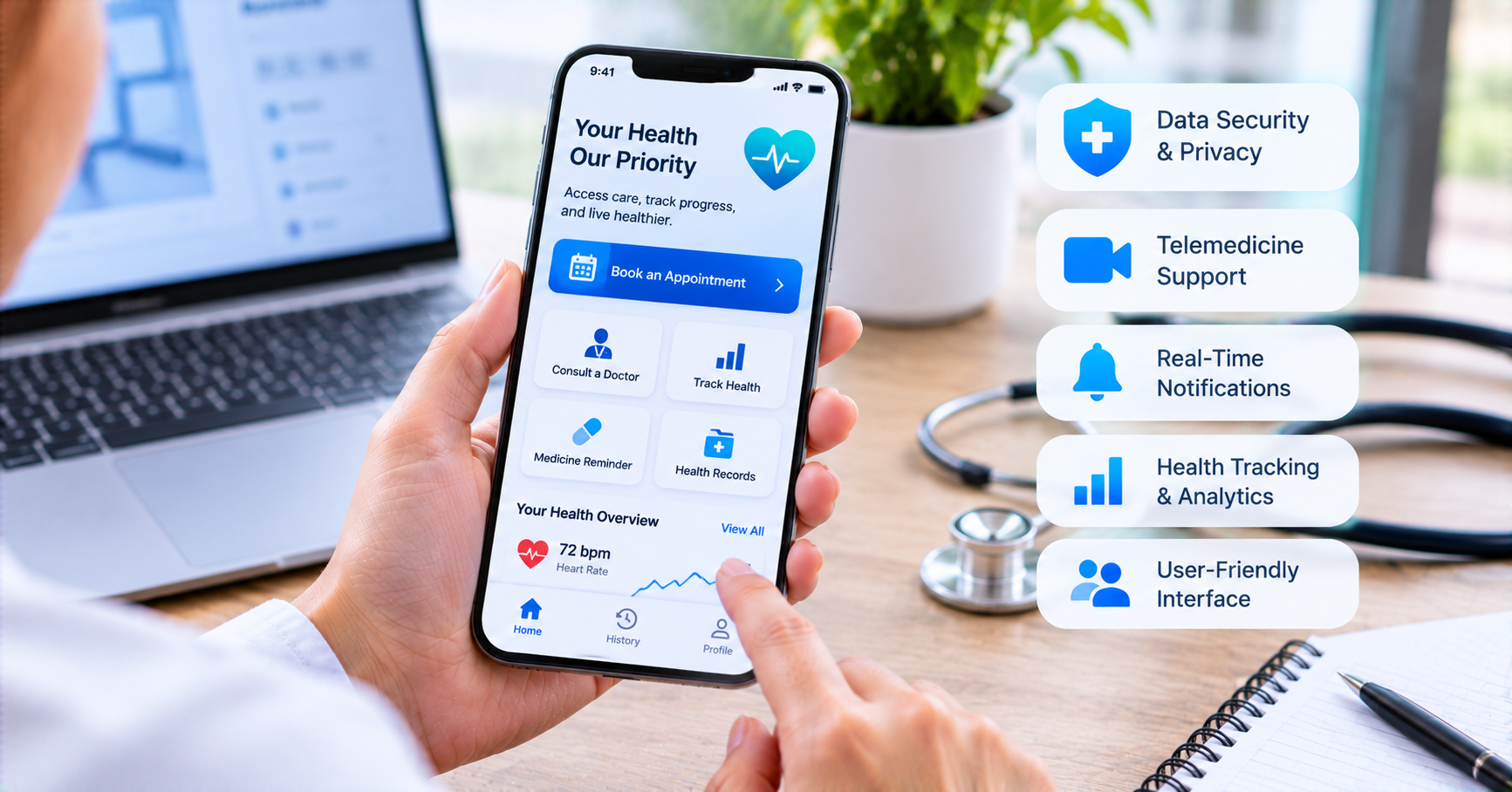

Samira Tahir joined the digital transformation team at a regional hospital group in Riyadh three years ago with a mandate she describes as both exciting and slightly terrifying: build the patient-facing app that the hospital system had been promising its board for two years. She had a background in healthcare operations, not software. The team had one in-house developer and a budget she couldn’t discuss in detail but which she described as “enough to do it wrong and not enough to do it twice.”
She spent her first four months reading case studies of healthcare app failures. She wanted to understand what she was walking into before she committed the budget to walking into it.
What she found, consistently, was the same root cause expressed in different forms. Teams that built healthcare apps around what seemed logical in a meeting room and discovered, after launch, that clinical staff found the workflow disruptive, that patients couldn’t navigate the interface, that the system integration had been underestimated, or that a regulatory requirement had been missed and would require significant rework to address.
She hired a Healthcare App development company with a specific requirement before signing: they had to have built and launched at least one app that was currently being used by patients in a clinical setting, not a demo, not a prototype, a live product with real users. That requirement filtered the field considerably. The company she chose showed her their analytics dashboard for two live products and walked her through what they’d learned building them.
Samira’s app launched fifteen months later. It works. Staff use it. Patients use it. The board is satisfied. She told me recently that the features that made it work weren’t the ones that impressed anyone in a presentation. They were the ones that made it possible for a sixty-seven-year-old cardiac patient to check his medication schedule without calling the ward.
User Profiles That Reflect Reality, Not Assumptions
The first design mistake in healthcare apps is treating patients as a homogeneous group. They are not. A cardiac rehabilitation patient monitoring their own recovery is doing something fundamentally different from a mother scheduling pediatric appointments for three children, who is doing something different from a GP clinic’s receptionist managing an appointment queue, who is doing something different from a cardiologist reviewing a remote monitoring alert.
Each of these users needs a different interface, a different information architecture, and a different interaction model. Building a single interface that attempts to serve all of them produces something that serves none of them well enough.
Role-based profiles, where the app presents a different experience to different user types based on their relationship to the healthcare system, are the structural answer. A patient profile shows personal health information, appointments, and communication tools. A clinician profile shows patient cohorts, alerts, clinical task lists, and documentation. An administrative profile shows scheduling, operational metrics, and workflow management. These are different products that share an infrastructure, and designing them separately before combining them on a shared backend produces better outcomes than designing a single interface and adding roles to it later.
The patient profile’s specific design deserves particular attention because patients are the users healthcare apps most often fail. Clinical staff are professionals who learn complex tools as part of their job. Patients bring every level of digital literacy, health literacy, cognitive capacity, and emotional state to the interface. A patient arriving at a hospital app after receiving a difficult diagnosis, managing a condition that affects their concentration, or navigating digital interfaces in their second language is not the same as the developer who tested the product. Designing for that patient requires more than usability testing with digitally comfortable volunteers.
Appointment Scheduling That Handles Complexity
Appointment booking is the feature that patients want first and the feature that breaks most often in healthcare apps, because healthcare appointment logic is more complex than most booking systems are built to handle.
None of this is visible to the patient as complexity. They see a calendar, choose a time, and receive a confirmation. The complexity lives in the integration between the app and the scheduling system, and it requires deep integration rather than a surface connection.
The difference between a booking confirmation that actually reflects the healthcare system’s capacity and one that creates a phantom appointment that a human has to reconcile later is the difference between a feature that helps the operations team and one that adds work to their day. Healthcare apps that book appointments into a live schedule synchronization with the hospital’s patient administration system serve the first function. Apps that send a booking request to an email inbox for a human to confirm serve the second, and they fail when volume grows beyond what that human can manage.
No-show reduction is the measurable outcome that appointment management features should be evaluated against. Automated reminders at twenty-four hours and two hours before, delivered through push notification and SMS backup for patients whose phones may not support push, with a one-tap reschedule option that maintains the booking rather than releasing the slot to the unknown, reduce no-shows by margins that translate directly into provider revenue and patient care continuity.
Telemedicine That Works on the Network Conditions Patients Actually Have
Video consultation is now a standard expectation in healthcare apps, and the quality gap between implementations is significant.
The technical requirement that most implementations underinvest in is adaptive video quality. A patient connecting from a hospital carpark on mobile data has a different network condition from a patient at home on fiber broadband. A video system that drops to voice-only or disconnects when bandwidth drops below a threshold does less harm than one that maintains a poor-quality call that the clinician can’t see clearly enough to make useful observations.
The clinical workflow around video consultation matters as much as the technology. A clinician who can see the patient’s relevant record in a panel during the call, without switching applications, is conducting a different consultation from one who has to close the video to open the record. The ability to share the screen to show a patient their scan results, review a medication list together, or display a rehabilitation exercise diagram adds clinical value that most video platforms don’t support by default.
Consent management for telemedicine sessions requires specific attention. Recording a clinical consultation has different consent requirements from recording a social video call. The app needs to handle consent capture, storage, and retrieval in a way that creates a defensible record. This is a compliance requirement, not a preference, and it needs legal review specific to the jurisdictions where the telemedicine service operates.
Medication Features That Support Rather Than Complicate
Medication is the area where healthcare app features most directly affect patient safety, which changes the design standard from usability to something closer to clinical accuracy.
A medication list in a healthcare app is useful only if it reflects the patient’s current prescriptions, not the prescriptions from their last visit six months ago. Synchronization with the prescribing system, whether that’s the hospital’s EMR or a national prescription database where one exists, is the technical requirement that determines whether the medication feature is a safety tool or a safety risk. A patient who sees a medication on their app list that was discontinued three months ago and takes it because the app showed it is experiencing a harm caused by the technology.
Reminder systems for medication adherence are among the most evidence-supported features in digital health. The design that works best is not a fixed daily alarm but a schedule-aware reminder system that accounts for meal-dependent medications, multiple-daily-dose regimens, and the patient’s actual routine rather than an assumed standard day. A patient whose blood pressure medication is supposed to be taken with breakfast needs a reminder that fires relative to when they typically eat, not at a fixed hour that may be before they’re up.
Refill alerts are the third component of a complete medication feature. A patient who runs out of a critical medication because nobody flagged that the supply was low is experiencing a system failure. The app that tracks days of supply remaining and sends an alert with sufficient lead time to arrange a refill before the patient misses a dose is preventing a clinical event rather than just providing information.
Secure Messaging That Clinicians Will Actually Use
Secure messaging between patients and clinical teams is one of the most frequently requested features in patient app surveys and one of the most frequently abandoned after launch. The abandonment pattern reveals a design problem: most secure messaging implementations were built for patient needs without adequately considering the clinical workflow implications.
A message from a patient that arrives in a generic inbox visible to everyone on the team, routed to no specific person, and generating no alerting for the type of content it contains is not a clinical tool. It’s a documentation risk. Clinicians who don’t check it aren’t being negligent. They’re prioritizing the communication channels that have clear accountability.
Effective clinical messaging requires clear routing. Each of these is a different message requiring a different response, and an app that doesn’t distinguish between them creates work rather than reducing it.
The response time expectation that the app communicates to patients is a compliance and safety matter, not just a service matter. An app that implies clinical staff will respond to any message within hours creates an expectation that needs to be manageable in clinical reality. Clear communication about what the secure messaging channel is for, what response times are realistic, and what situations require a phone call rather than a message prevents the emergency-in-message-form that some patients use digital channels for when they don’t know any better.
Patient Records and the Design of Understanding
Giving patients access to their own health records is now a regulatory requirement in multiple jurisdictions and a design challenge in almost all of them.
The challenge is the difference between data and information. A haemoglobin A1c value of 8.2 is data. That same value with a reference range that shows where 8.2 sits, a plain-language explanation of what HbA1c measures and why it matters for someone with diabetes, a comparison with the previous result, and a note about what the clinical team recommends in response to this result is information that a patient can act on.
Most record access implementations release data. The apps that build trust with patients release information, and they do this not by withholding records but by contextualizing them. The investment required is in content design alongside technical development: clinical content writers who can translate result categories, diagnostic codes, and clinical notes into language that a patient without medical training can navigate.
The timing of result release requires clinical policy decisions before technical implementation. Results that are released before a clinician has reviewed them may be technically immediate but clinically premature. A patient who receives an abnormal imaging result on a Friday afternoon without the context of what it means, what happens next, and whether it’s urgent or requires monitoring is receiving a harm alongside the information. The app’s release logic needs to reflect a clinical workflow, not just a data availability trigger.
Integration: The Infrastructure Nobody Sees
Every patient-facing feature in a healthcare app is only as reliable as the integration behind it. Appointment availability is only as accurate as the connection to the scheduling system. Medication lists are only as current as the prescribing system feed. Lab results are only as timely as the laboratory information system connection. Patient identity is only as consistent as the master patient index that resolves whether the John Smith in the app is the same John Smith as in three different clinical systems.
Integration in healthcare is harder than in most software domains because the systems being integrated are old, diverse, incompletely documented, and slow to change. FHIR provides a modern standard that newer systems support, but older systems often speak HL7 v2, proprietary vendor formats, or sometimes a file transfer protocol that predates modern APIs.
The development timeline and budget for a healthcare app with serious clinical integration is materially affected by integration complexity in ways that aren’t apparent from the feature list. Healthcare App Development cost increases significantly when the integration layer requires custom connectors to legacy systems, when test environments for those systems aren’t available during development, or when the systems being integrated have change control processes that slow down connection approval.
Planning for integration realism means getting a technical assessment of the target systems before the project scope is finalized, not after. The assessment changes what the first version can promise and what it will actually need to deliver.
What Launched and What Samira Would Do Differently
Samira’s app launched with five features: appointment booking, teleconsultation, secure messaging, medication reminders, and lab result access. Not the feature list she’d started with, which was longer. Not the feature list the board had initially wanted, which was longer still. The five that launched were the five that clinical staff and patients in a pre-launch testing group actually used consistently.
She told me she would do one thing differently. She would have brought clinical staff into the feature prioritization process earlier, not to evaluate features they’d been shown but to describe their actual workflow problems before any feature had been proposed. The two rounds of scope reduction that happened mid-project were both driven by clinical staff feedback that the original feature set didn’t fit how they worked. Starting with that feedback would have produced the same scope in less time and with less tension.
The sixty-seven-year-old cardiac patient she mentioned, the one whose medication schedule question the app answered without a phone call to the ward, is still a patient in the system.
He told his daughter about the app. She told a friend who is a patient at a different facility. The friend asked whether that hospital had something similar.
That conversation is what a healthcare app is supposed to generate. Not award nominations or press coverage. A patient who found something useful telling someone else that it exists.
Features don’t create that. Useful features, designed from genuine need, do.


Join the conversation